
Mind the gap?
The most prominent measure of consumer sentiment has become unmoored from the real economy.

Funky consumers
There is a puzzling gap between the health of our economy and the public’s opinion of it, which seems inexplicably downbeat. Consider, for example, a February article in the Wall Street Journal titled “Why Americans Are So Down on a Strong Economy”:
There’s a striking disconnect between the widely shared pessimism among Americans and measures that show the economy is actually robust. Consumers are spending briskly—behavior that suggests optimism, not retrenchment. Inflation has tempered. Unemployment has been below 4% for 24 straight months, the longest such stretch since the 1960s.
The disconnect has puzzled economists, investors and business owners. But press Americans harder, and the immediate economy emerges as only one factor in the gloomy outlook. Americans feel sour about the economy, many say, because their long-term financial security feels fragile and vulnerable to wide-ranging social and political threats.
This article stands out somewhat in my mind because the reporter managed to interview a downbeat American whose name is Funck. But in all other respects, it resembles many other articles that focus on The Gap. Unfortunately, by focusing on the average, using generalized terms like “Americans” or “consumers”, these articles miss a more interesting story that’s revealed when you take the time to look below the surface.
A sentimental journey
Objective assessments about the state of the economy, of course, are made on the basis of indicators like inflation rates, GDP, unemployment rates, and the like. But how do we know what Americans or consumers think about the economy? And how do we know that this sentiment is less optimistic than expected? How do we know that The Gap exists?
There are two prominent measures of consumer sentiment or consumer confidence: one published by the Conference Board (the Consumer Confidence Index), and a second by the University of Michigan (the Consumer Sentiment Index — the CSI). Both are based on household surveys and are published monthly. The logic behind the indices is as follows:
In the U.S., consumer spending makes up a majority of economic output. As much as 70% of gross domestic product (GDP) is driven by a consumer spending component, so the sentiment or attitude of consumers goes a long way in gauging the health of the economy.
The CSI has been published since 1946 and is considered the “best-known” or “most prominent” index. The index is based upon responses to five questions about the economy. Two questions ask about current conditions (Is it a good time to buy major household items? Are you better or worse off than a year ago?). The remaining three questions deal with the future (opinions about personal or business conditions in the next 1-5 years). Responses to the five items are combined based on the preponderance of favorable or unfavorable ratings to create an index score.
I will concentrate on the CSI because the University of Michigan provides breakdowns of the data which facilitated the analyses below. Also, it’s free. It wasn’t always that way, at least for those who wanted to get the results before most people. In 2013, the Thompson Reuters corporation announced it “would suspend its early release of the widely watched Thomson Reuters/University of Michigan consumer sentiment data to a small group of clients.” This was a reaction to an investigation by the New York attorney general who was “particularly concerned that a select few clients pay $6,000 a month to receive the data, which is issued twice a month, two seconds earlier than other clients.” Two seconds, by the way, is enough to give high-speed, computerized stock traders a significant edge in the markets.
I don’t know whether that’s still going on, but the CSI is still a big deal. It’s followed closely by investors and economists hoping to get a hint on whether the economy is improving or deteriorating, and it always gets at least a mention in the news when it’s released.
CSI: Economics
Given the importance of the CSI, the following headline last September in The Economist caught my eye:
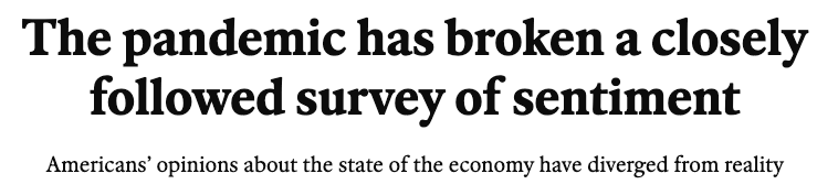
The article presented a statistical comparison between actual CSI values and “expected” CSI values for every month from 1980 through last year. Expected CSI values were created by training a statistical model that used some of the objective economic measures I mentioned earlier to predict CSI values. The authors trained the model on data from 1980 through 2016 (just before the beginning of the Trump administration) and then used it to predict subsequent values.
The Economist article was a little short on details regarding their economic model, but from what they said and from a similar article reported in the excellent Briefing Book substack, I was able to build my own model that performed almost as well as the Economist model1. My linear regression model used five monthly variables to compute expected CSI values: unemployment rates, inflation rates, Fed interest rates, gasoline prices, and changes in the S&P 500 index. Using this model, I was able to update the Economist chart with newer data through January 2024.
The chart above shows expected CSI values (darker blue line) and actual values (lighter blue line). Note that higher CSI values indicate optimism and lower values indicate pessimism. The gray regions in the graph show recessions.
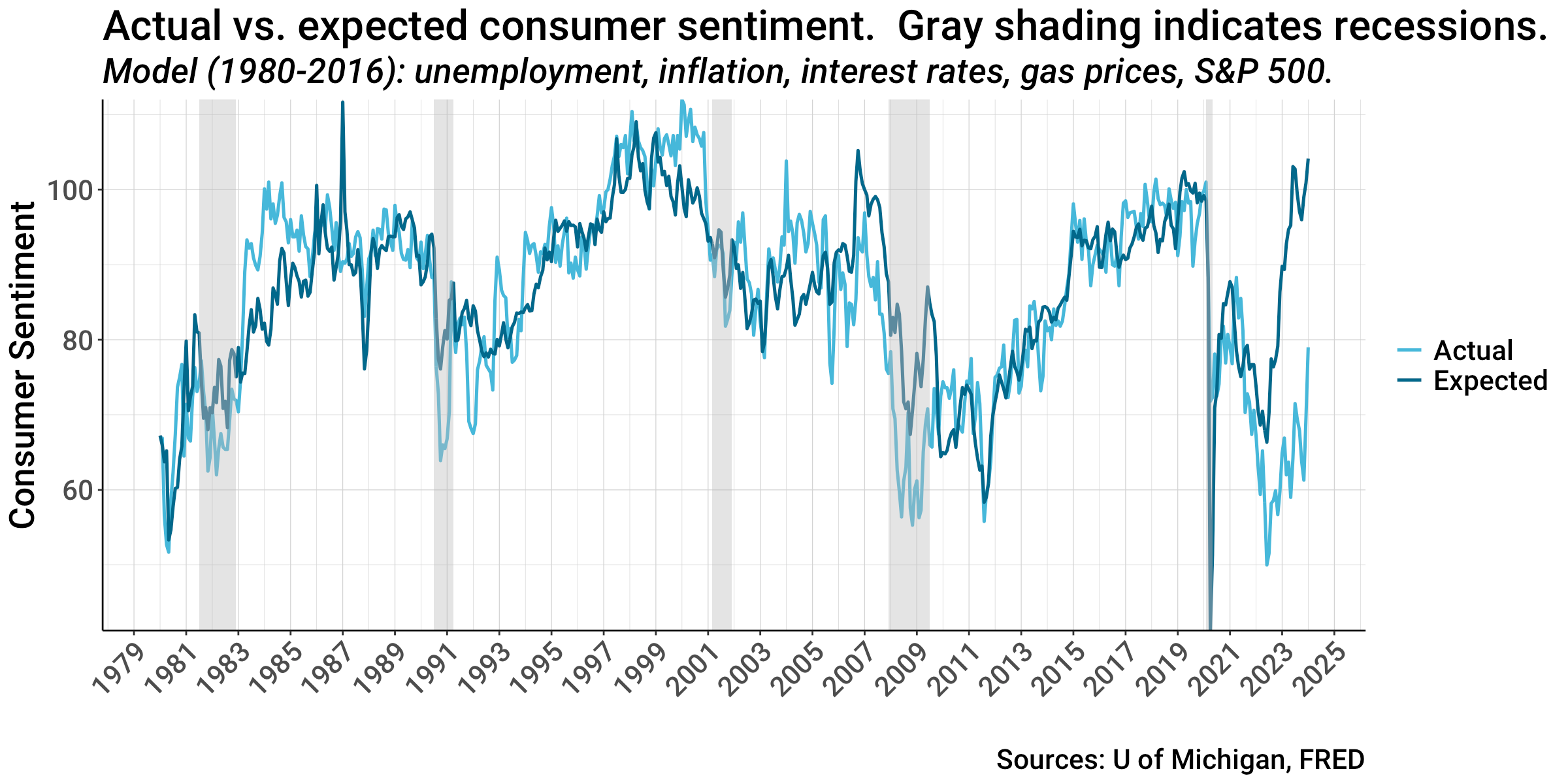
You can see that until around 2020 when the pandemic recession occurred, the expected and actual values were quite close to one another. The graph shows relatively brief periods before the pandemic when they diverged somewhat, but by and large expected and actual CSI values tracked one another fairly closely. However, beginning around 2022 a large gap developed and has persisted through January 2024. You can see the gap better in the following graph which focuses on the most recent years.
The gap (highlighted in red) began in July 2021 when the actual CSI values fell below those expected from the economic data. The gap reached its maximum last June when the CSI was 39 points below expectations. It has closed slightly, but is still large, with a 25 point gap in January 2024. So far, the gap has lasted for over 2 ½ years. This is the gap that economists and pundits are puzzling over.
Cheers and boos
Lately, some analysts have discovered that this gap in consumer sentiment is far from uniform among those surveyed. It turns out that there is a strong partisan component to the CSI that contributes greatly to the gap.
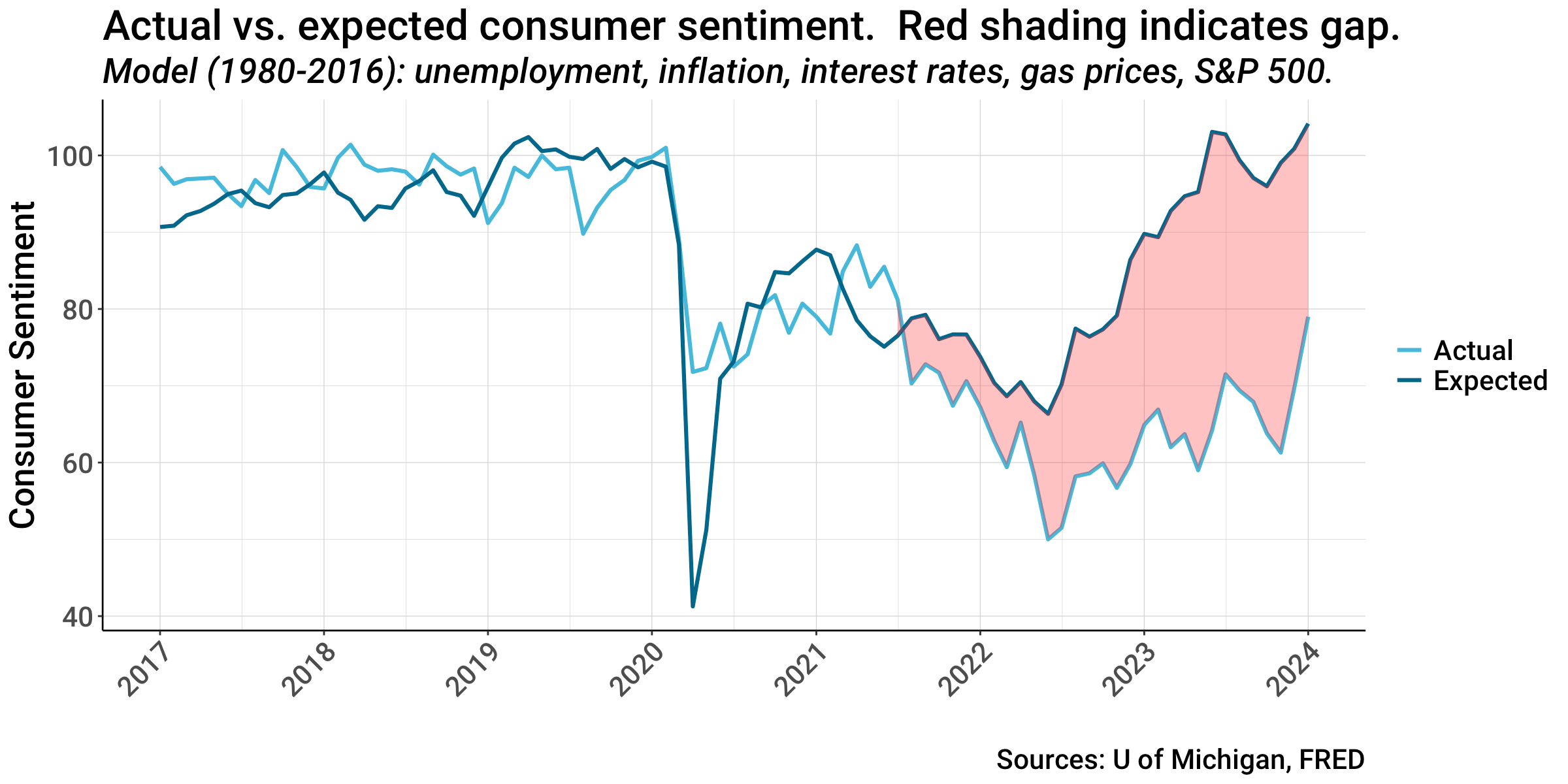
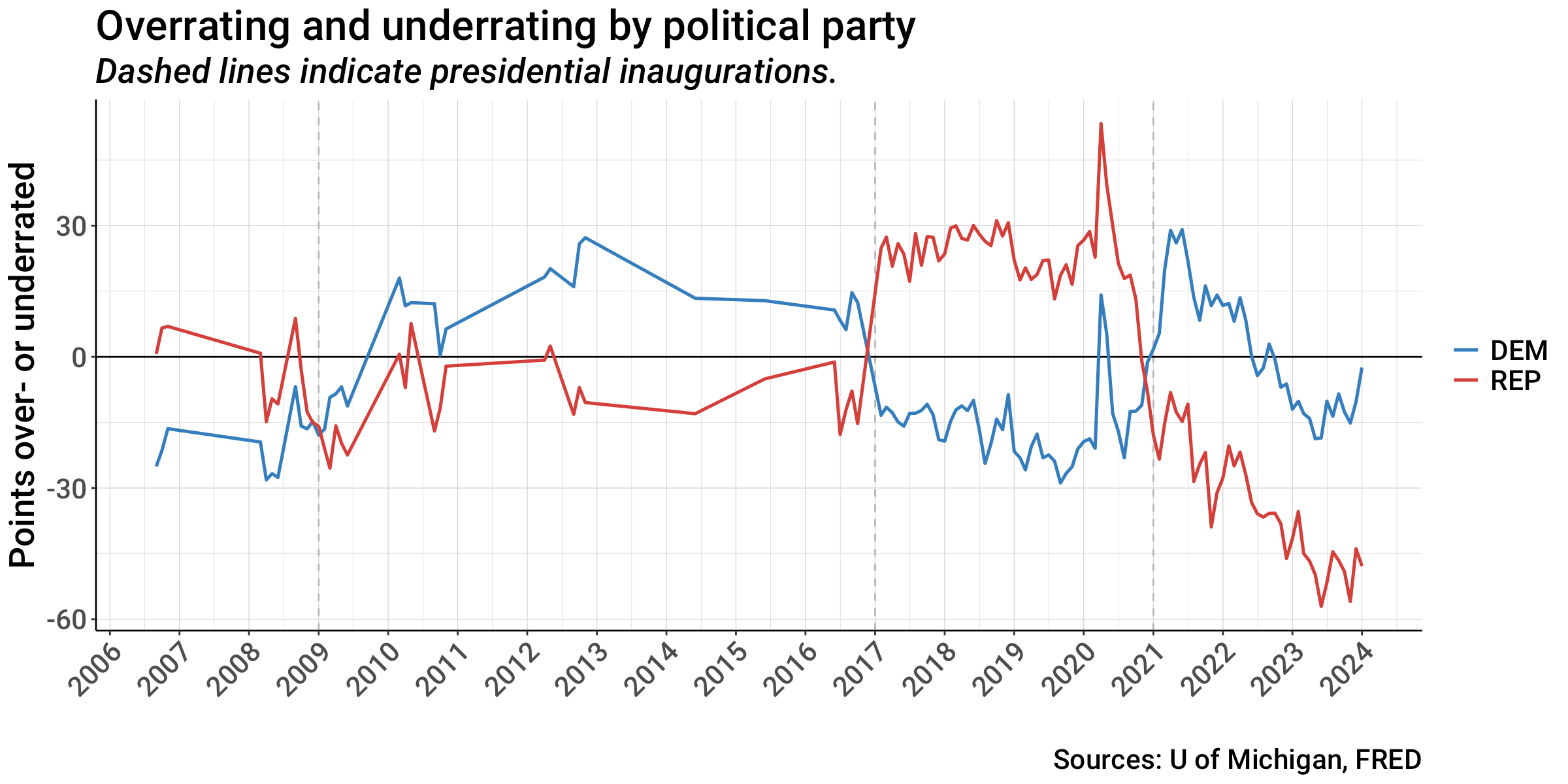
The University of Michigan began publishing CSI data separately in 2006 for self-identified Democrats, Republicans, and Independents. It published these data sporadically until 2007 when monthly reporting began. The graph above shows the CSI separately for Democrats and Republicans (Independents are not shown, but always fall between the two groups). The vertical dashed lines show when new presidential administrations began (Obama in 2009, Trump in 2017, and Biden in 2021).
There is a clear difference between the ratings by Democrats and Republicans. Democrats rate the economy better than Republicans when a Democratic president is in office, while Republicans like the economy better when a Republican is in office. There is a rapid and dramatic switchover in the ratings in the months following the election of a new president of a different party. Between these switchovers, Republicans and Democrats roughly parallel one another as the economy goes through its ups and downs.
A February paper by the analysts who produce the CSI shows that these partisan differences have grown from 21 to 25 points under Bush and Obama to 53 and 45 points under Trump and Biden. These partisan differences are currently larger than differences among age, income, or education groups, and are about as large as the differences in the overall CSI index between economic cycles.
Briefing Book refers to this effect as “cheers” and “boos”. We tend to cheer the economy (boost our ratings) when “our guy” is in office, and boo the economy when the “other guy” is in office. However, based on their models and analyses, Briefing Book conclude that the effect is larger for Republicans than for Democrats: Republicans “cheer louder” and “boo louder” than Democrats. They confirmed this effect using several different economic models, and it showed up in my model too.
The graph above shows the difference between Democratic and Republican CSI values and the expected CSI rating from my economic model. Higher values (those above zero) indicate ratings that are above the value expected based on economic data (i.e., overrating the economy), while lower values (those below zero) indicate ratings that are below the expected value (underrating the economy). You can see that during the Trump administration, Republicans strongly overrated the economy. Democrats underrated it, but generally by a smaller amount. However, since the pandemic, Republican ratings have nosedived and have been far below expected values throughout the Biden administration (currently, 48 points below). Democrats, in contrast, overrated the economy at the beginning of Biden’s term, but began underrating it as inflation took hold. They are on the upswing now and are presently quite close to the expected value (within 3 points).
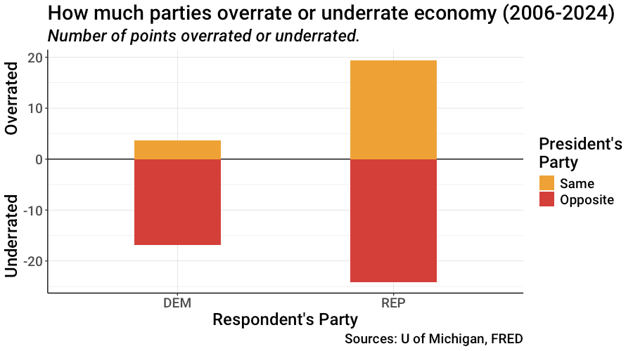
This graph summarizes the cheering and booing statistics for the entire time period from 2006 through the present. The two bars represent ratings by Democrats and Republicans and show the degree to which survey respondents over- or underrated the economy when the president was from the same party or from the opposite party. Across the time period, Democrats “cheered” (overrated) the economy under Democratic presidents by about 4 points, and “booed” (underrated) the economy under Republicans by 17 points. Republican cheered Republican presidents by 19 points, and “booed” Democratic presidents by 24 points. As Briefing Book put it, Republicans cheered and booed louder than Democrats.
For just the Biden administration, Democrats have cheered by only 2 points, while Republicans have booed by 33 points — a massive difference. So when you read that there is a consumer sentiment gap and that “Americans” or “consumers” are irrationally dissatisfied with the economy, recognize this as an inaccurate and rather lazy summary of the current situation. The fact is that Democrats are nearly spot on in their feelings about the economy today; their ratings accurately reflect the true state of affairs. Their ratings of the economy are now almost as high as they’ve ever been in the last 18 years — since 2006 — and this rating has been improving rapidly since around the middle of last year.
In contrast, Republican CSI ratings are irrationally low — massively underestimating the strength of the economy. Their data for the last few months show some evidence of stabilizing relative to the economic data, but are at a very low level, not far above the worst ratings during the depths of the Great Recession.
Fair and balanced?
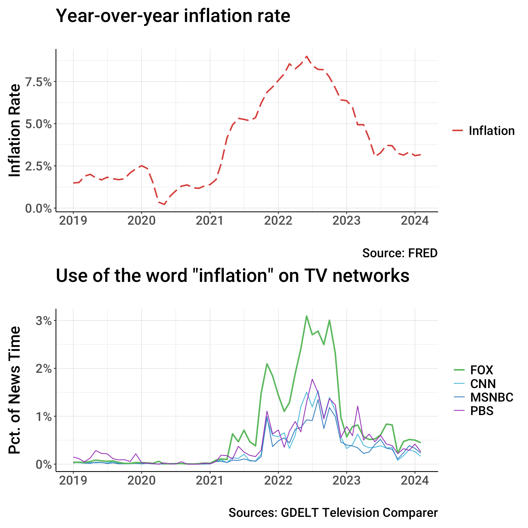
One can speculate about the reasons that Republicans cheer louder and boo louder, but the news media favored by many Republicans surely contribute to reinforcing their beliefs. Consider the graphs above. The dashed red line in the top graph shows the monthly year-over-year inflation rate from 2019 to the present. Inflation was low and steady until the pandemic recession in 2020. As we began recovering from the pandemic, inflation increased rapidly, peaking at 9.0% in mid-2022, and then falling to its current level which is about 1.7 points above the rate at the beginning of 2019.
The lines in the bottom graph represent the percent of news time on major cable networks (FOX, CNN, MSNBC, and PBS) in which the word “inflation” was used. These data come from the GDELT Project which analyzes transcripts from news broadcasts, breaks them into 15-second segments, and enables the user to calculate the percent of segments in which specified words were uttered (which is very cool!).
You can see that all news organizations shown in the graph increased coverage of inflation as the inflation rate increased, and decreased coverage as it eased. However, the green line, representing FOX, jumped much more than the others. At its peak in June 2022, FOX news shows mentioned “inflation” twice as often (in 3.1% of its 15-second time blocks) as the next highest network (1.5% for CNN).
Could this emphasis on FOX’s part (and presumably in other right-wing news media and social media) contribute to Republican perceptions of the economy? To quote a long-gone slogan from the “Most Trusted, Most Watched” news organization in America, “We Report, You Decide”.
The Economist claimed that their model accounted for 86% of the variation in the CSI. My model accounted for 68%, still a very good fit. My linear regression model included the following predictors: quarterly return on the S&P 500, unemployment rate, year-over-year inflation rate, Fed interest rate, and the quarterly gasoline inflation rate. All predictors were statistically significant with p<0.001. I am indebted to both The Economist article and the Briefing Book post for providing templates for my analyses.
Excellent! Thank you Senor Malitz! Great research and reporting! Love your graphs, keep 'em coming.
Thanks for this excellent analysis, David. I did not know — but am not all surprised to learn — that how people feel about the economy is so strongly correlated to their political affiliation. Is there anything that is not explained by political affiliations?